Conclusions
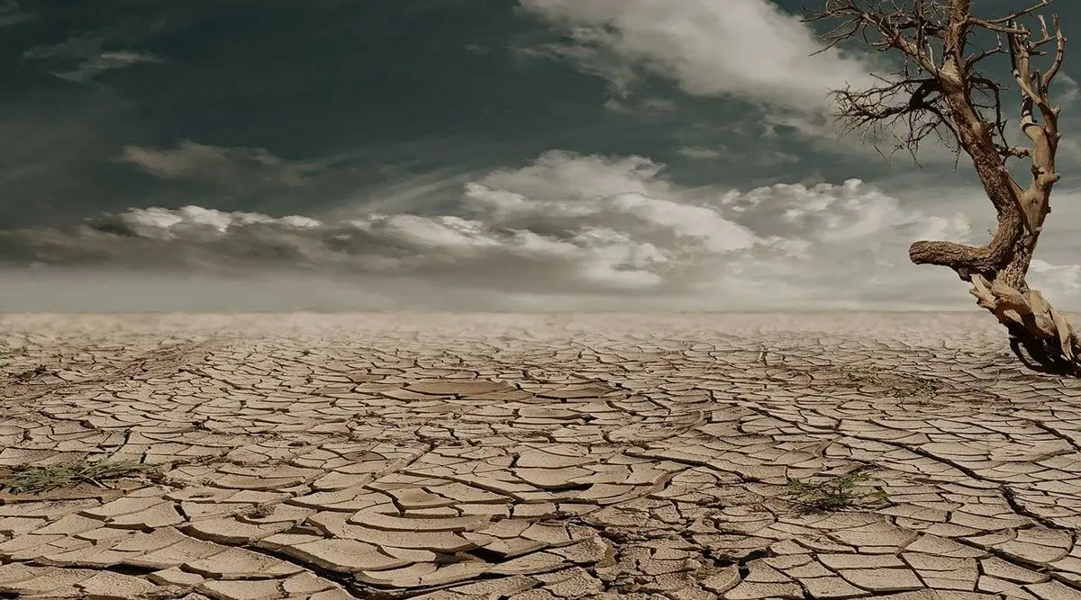
Climate change is an important topic these days, with temperatures rising, extreme weather becoming a far more common occurrence, and people worldwide getting displaced. There are many reasons behind climate change, but using a simple graph, it is clear the average temperature on our planet is slowly rising. Even though a slow temperature rise may seem insignificant, it is clear that some impact is being presently. As seen in previous sections of this project, the number of floods, wildfires, and droughts are rising. Even this can be seen in the news today, especially with the increased severity of hurricanes. Per a simple visualization from Wikipedia, we can see clear evidence that temperatures are rising.

In this project, the goal was to attempt to forecast several different climate-related trends based on previous data points. Specifically, this project focused on the correlations and trends in temperature and disasters such as wildfires, droughts, and floods. In addition, the hope of this project was to gain insight into how the temperatures were changing over time and whether that affected the occurrence and strength of these naturally occurring events. Towards the beginning of this project, ten questions were laid out as goals for this project to answer. In the subsequent sections, each of the questions are addressed and evidence to answer each of the questions is presented.
Trends in Temperature
The first question in this project concerns the trends in weather over the past 100 years. By using the work completed in the Data Visualization section and the Exploratory Data Analysis section of this project, the following visualizations should be able to answer this question.

First, the high-level view of temperature change over time is seen by viewing the min and max temperatures visualization. The data, as expected, is seasonal and, overall, slightly increasing. To better visualize the seasonality of temperature data, the next tab shows a heatmap of the temperature that California experiences. Here the darker sections show a higher temperature (during the summer months), while the lighter color shows a colder temperature. Finally, to get a better sense of the trend, a 10-year moving average plot of the temperature was constructed. This plot shows a smoothed trend line over a 10-year average period clearly showing a slight increase in temperature over the past 100 years.
Trends in Droughts
Next, the data for each natural disaster is examined further as individual analyses. First, the drought data is modeled and visualized. This analysis aimed to understand the drought conditions over time and attempt to forecast what might happen in the near future. The following visualizations and results were achieved using information collected from the US Drought Monitor.


Using the above visualizations, a good attempt at answering the question concerning the trends of droughts can be made. In the first plot, a comparison between drought conditions and precipitation numbers is made. In the plot, the precipitation numbers are seasonal, with some variation across the years where more precipitation occurs. The argument that high amounts of rainfall precedes low drought conditions should be made, but from the plot above, it is not clear the data backs this up. Next, by utilizing a similar technique as the temperature analysis, a heatmap of drought conditions shows a lack of seasonality in the data. However, it does show that periods of drought span across many months, as once you are in a drought, it seems difficult to get out. Perhaps this equates to periodicity in the data rather than seasonality, where long periods of drought are followed by similarly long periods of no drought. In the next plot, the 20-year moving average shows no trend in the number of droughts, just a large amount of variation. Finally, because this data has a large amount of variation and a lack of seasonality, the forecast is poor. Perhaps including more information, including historical temperature and precipitation data, would significantly improve forecast accuracy, but this is grounds for further exploration for this project.
Trends in Wildfires
Wildfires are incredibly destructive, especially in California, where they are all over the news. Considering the number of headlines that wildfires take up during the hot months in the west (California, Oregon, and Washington), the data should show spikes in the number of wildfires in recent years. An examination of this data should conclusively answer whether data can back up these trends and whether we can forecast into the near future.


Starting by visualizing the data over time; two states stood out immediately, California and New York. In the plot of California wildfires, it shows clear seasonality in the data, but considering the five-year moving average plot, the trend does not seem to have increased or decreased over the past 25 years. However, in New York, a surprising result is seen. The number of wildfires in New York dramatically increased starting in 2000 with massive spikes in 2005 and 2008. It was not clear why, New York had an enormous increase in the number of wildfires. However, California seemed like the most logical state for this project to attempt to forecast the number of wildfires. The state has seen the most number of wildfires, and the economic cost is the highest in the nation. Using forecasting techniques, the state of California should continue to see a large number of wildfires. One might recommend that spending to minimize the impact of these fires should probably increase in anticipation of the heightened risk during wildfire season.
Trends in Floods
Finally, when looking at data concerning the number of floods across the United States, it seems more sporadic than wildfires and droughts. This makes perfect sense as floods are generally an impact of unexpected and short-term severe natural events involving massive amounts of precipitations (e.g. hurricanes). However, according to scientists, the increase in the number of floods is directly linkable to global warming, so the data should show the results of this. Below are several visualizations that show statistics like floods over time and the potential for floods in the future.


In a similar fashion to the wildfire data, starting with the first two visualizations, the number of floods in Indiana vastly differs from the number of floods in California. In California, the average number of floods is generally double that of Indiana. The variation and trends of floods in California seem to increase surprisingly. Although, periodically, there is a season of floods in California that is exceptionally severe versus Indiana, the periods of severe floods are sporadic. Using California as a baseline, the moving average plot shows a gradually increasing trend in California, which tends to agree with the national average. However, on a state-by-state basis, this is not the case (see the Indiana plots). Finally, an attempt to forecast the number of floods fails to produce a model that accounts for the variation in the flood data. The forecast is essentially the average of the data, which is helpful in a couple of scenarios but leaves much to be desired.
Towards the beginning of this project, a narrowed focus was put on the Washington DC Metropolitan area. That is where I live, and I would be most interested in understanding the trends in weather data. However, this project quickly pivoted into looking at California-based data as this data was far more in-depth and provided a unique perspective on climate change as a whole. The sourced data has information on this, so this type of exploration done on California could provide good insight into the DC Metro area, but that is left for further investigation.
/GettyImages-497322993-598b2ad403f4020010ae0a08.jpg)
Going Further
Finally, given the scope of this project, an effort could not be made to quantify the cost of climate change. An attempt at modeling climate-related companies was made, but any relationship between climate change and the model of the stock prices in this particular section cannot be made without a far more extensive analysis and further work.
With this particular project, there are a couple of obvious next steps that should be taken to improve this analysis. First, there is a cause and effect between sets of data, so a multivariable analysis should be done in order to attempt to quantify the impact of certain variables on others. For example, precipitation affects the number of droughts each year. The less the precipitation and the hotter the average temperature, the higher the percentage chance of drought. A harsh wildfire season plus a large amount of rainfall following the season should increase the number of floods. A hotter than average summer plus a lack of wildfires in the previous season should increase the chance for wildfires in the future. Given these scenarios, a multivariable model should predict increases in wildfires, droughts, and floods more accurately. This is an excellent next step for this project, but it will have to be continued at a later point.