
Modeling Weather Time Series Data
Next, when first attempting to model time series data, the first model considered is an autoregressive or moving average model. These AR/MA models are used to understand better the data and forecast future values based on historical data recorded previously. Before using these models, the time series must be stationary, meaning the mean and variance do not change over time. The most often cause of a violation of stationarity is a trend, where values slowly increase over time. So first, to check whether the data is stationary, we can use an ACF (autocorrelation function) to test for stationarity. Below is the ACF plot for the weather data explored and visualized in previous sections.

To check for stationarity, most of the bars/lines must reside between the blue lines. This is not the case, but this can be remedied. Additionally, we can see the series is seasonal from the ACF plot. The series can be seasonally differenced to create a stationary process to remedy this situation.

Per the figure above, the series is now stationary. An Augmented Dickey-Fuller test also confirms this to be the case. Once the series is stationary, the next steps toward modeling the data using ARMA can be taken. Once the series is stationary, the combination of the ACF and PACF will provide insight into the bounds for the parameters in the ARMA model. The parameters, which are the significant values from the ACF/PACF plots, will allow us to model the data to emulate the real-world data. Since there was a need to difference the data at least once seasonally, the model built is a SARIMA model, or seasonal autoregressive integrated moving average model. In order to determine the parameters for the SARIMA model, both the ACF and PACF plots should be inspected.

From the ACF and PACF figures above, we can determine a range of p and q values for the seasonal and nonseasonal components that will be fitted in the SARIMA model. Considering the ACF plot, the appropriate q value should range between 0-2, and the seasonal Q value should range between 1-2. Additionally, given the PACF plot, the appropriate p value should range between 0-2, and the seasonal P value should range between 1-2. Finally, since the data was seasonally differenced once but never differences a second time, the nonseasonal d value should be 0 and the seasonal D value should be 1. Once these parameters have been chosen, the next step is to run several different SARIMA models and choose the model with the lowest AIC/BIC criterion. The following table shows the results of this experiment.
By sorting the table, the smallest AIC has the parameters of (1,0,1) with seasonal parameters (2,1,1), while by sorting using the BIC criterion, the model also has parameters of (1,0,1) but seasonal parameters (1,1,1). Next, there is a function that allows for an auto-selection of an ARIMA model. According to the auto.arima method in R, the parameters for the model should be (1,0,1) and (1,1,1) as well. Here, the simpler model is the (1,0,1) with (1,1,1), so that is what will be tried first.
Next, the model should undergo some diagnostics to make sure the fit looks good. Below are some basic diagnostics run using the selected model.
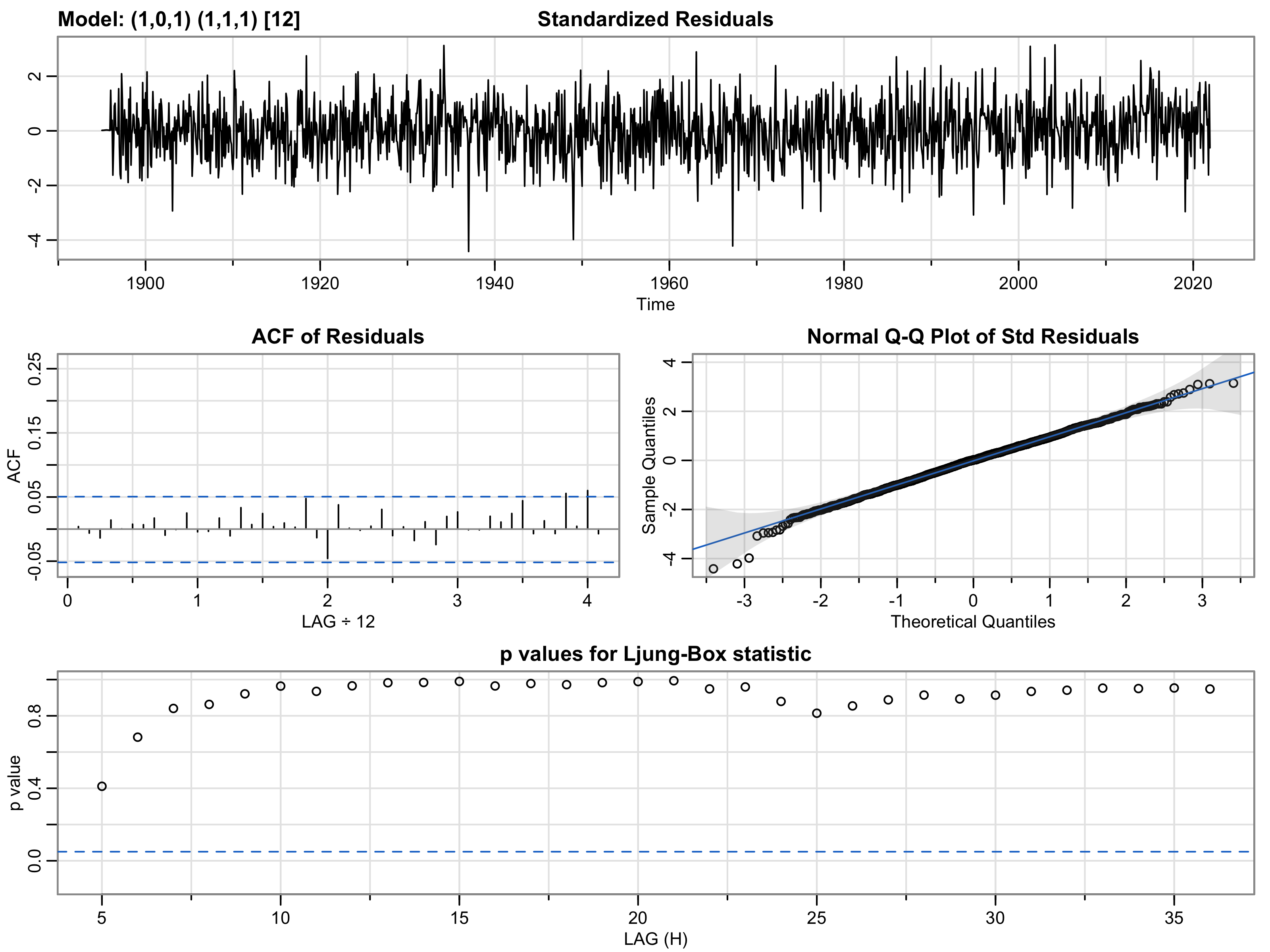

Given the figure above, the following observations can be made. First, when looking at the plot of standardized residuals, the mean should be around 0 with the variance at about 1. As seen above, this is generally true, with the mean close to 0. However, the variance is probably slightly more than 1, more toward 2. Generally, if the mean or variance is significantly different than expected, this would be a sign of a poor model fit, but we don't really see that here. Next, when inspecting the ACF of residuals, the plot shows no significant lags, which is a very encouraging sign considering the logic above. Next, when looking at the qq-plot, the hope is to see some signs of normality. Here, we see strong signs of normality in the data. Finally, when looking at the p-values for the Ljung-Box test, the p-values are much greater than 0.05, indicating the residuals are independent, which is an encouraging sign for the suitable model. Here, after doing the model diagnostics, the model above can be used for forecasting. Additionally, when looking at the residuals plot in the second tab, we can see similar results in terms of normality and mean/variance. Below is the equation for this model.
Φ1(1-B12)φ1(1-B12)xt-1 = Θ1(B)θ1(B)wt-1
Next, it would be prudent to run some methods to forecast future values. Below are two methods that show the SARIMA model attempting to forecast future values.


The two figures above show a pretty good idea of the near future and the long-term forecasted temperatures. In addition, the forecasts account for the seasonal variance in the data, which is an encouraging sign the models are working as intended. Finally, we can also run some cross-validation to double-check our models against the data and make forecasts. Below are two cross-validation checks, one for a single time period ahead and one for 12 time periods ahead.


From the forecasting horizon plot 1 step ahead, it seems the MSE is the lowest only one horizon ahead, and it rises logarithmically as the number of horizons increases. From the forecasting horizon plot 12 steps forward, the MSE is lowest at horizon 8, with the MSE varying quite a bit throughout the plot. Finally, before committing to the ARIMA model derived above, this model should be compared to other models such as the random walk forecast model, naive model, and mean forecast model. By utilizing the time-series data, each model can be tested and the prediction errors can be calculated. Below are the results.
Here, the mean forecast model performs really well as compared to our ARIMA model and far better than the naive and random walk forecast model. The mean absolute and squared errors for our SARIMA model are very close to the mean forecast model and much better than the other two. This makes some sense as weather data over time is fairly regular and a mean forecast model will pick that up. That does not mean our SARIMA model is a poor performer, but the mean forecast model also performs well.